Homeowners across the country are rethinking what their houses say from the curb, and 2026 is shaping up to be one of the most interesting years for exterior color in a long time. The safe beiges and predictable grays that dominated the last decade are losing ground to palettes that feel more intentional, more connected to the natural world, and frankly, more interesting. Whether you’re planning a full re-side or just starting to research what’s out there, understanding the siding color trends shaping 2026 will help you make a choice you’ll be happy with for the next 15 to 20 years.
The shift isn’t just aesthetic. New material technologies, growing awareness of energy performance, and a cultural move toward homes that feel grounded rather than flashy are all driving what’s popular right now. What follows is a practical breakdown of the colors, finishes, and pairings that are defining exterior design this year, along with some honest guidance on what actually works in the real world versus what just looks good on a mood board.
The Evolution of Exterior Aesthetics in 2026
The way we think about home exteriors has changed significantly over the past few years. Where the 2010s were dominated by farmhouse whites and cool grays, 2026 reflects a broader cultural appetite for warmth, texture, and environmental responsibility. Homeowners aren’t just picking a color anymore: they’re choosing a philosophy.
Two forces are driving most of the movement this year. The first is a deeper connection to the natural environment, and the second is a growing demand for materials and colors that reflect ecological awareness.
The Shift Toward Biophilic Design
Biophilic design, the practice of bringing natural elements into built spaces, has been influencing interiors for years. In 2026, it’s fully arrived on the exterior. Homeowners want their houses to look like they belong in their surroundings, not like they were dropped from a catalog.
This means colors that echo the land: sage greens in Pacific Northwest neighborhoods, sandy ochres in desert climates, slate blues in coastal towns. The goal isn’t camouflage but harmony. Architects and designers are increasingly specifying siding colors based on the local ecology rather than national trend reports, and the results feel more authentic. You’ll see fewer homes that look identical to their neighbors and more that seem to grow out of their specific place.
Sustainability and Eco-Conscious Color Palettes
The sustainability conversation has moved beyond material composition and into color itself. Lighter, more reflective siding colors reduce cooling costs, and manufacturers are responding with palettes specifically engineered for solar reflectance without sacrificing visual warmth.
Several major siding brands released “eco palettes” in late 2025 and early 2026 that pair low-VOC finishes with colors inspired by undyed natural materials: raw linen, unglazed clay, weathered stone. These aren’t just marketing exercises. The colors genuinely perform better in terms of UV resistance and heat management. Homeowners who care about their energy bills and their environmental footprint are gravitating toward these options, and they happen to look fantastic.
Earthy Neutrals and Grounded Tones
If there’s a single defining mood for 2026 siding colors, it’s “grounded.” The era of cool, almost clinical grays has given way to warm neutrals that feel lived-in and connected to the earth. These aren’t boring colors: they’re sophisticated ones that change character throughout the day as light shifts.
Warm Terracotta and Clay Inspirations
Terracotta is having a genuine moment. Not the bright, almost orange terracotta of a Tuscan villa, but muted, sun-baked versions that read as warm neutral from a distance. Think of the color of a clay pot that’s spent a few seasons outdoors: softened, complex, and deeply appealing.
This palette works particularly well on homes with natural stone accents or wood trim. James Hardie’s “Sedona Red” and LP SmartSide’s “Canyon Clay” are two of the most specified colors in this family right now, and both translate well across architectural styles from modern ranch to craftsman. The key is pairing terracotta siding with trim in cream or warm white rather than stark pure white, which can create too much contrast and make the clay tones look muddy.
The Return of Mushroom and Greige Variations
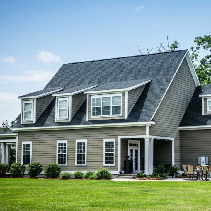
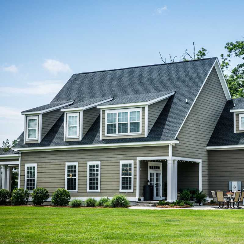
Greige, that elusive blend of gray and beige, never fully went away, but the 2026 versions are distinctly warmer and more organic than their predecessors. The hottest variation right now is what designers are calling “mushroom”: a soft, warm gray-brown that evokes forest floors and dried botanicals.
What makes mushroom tones work so well for siding is their versatility. They pair beautifully with both warm and cool accent colors, they hide dirt and weathering better than lighter neutrals, and they photograph well for anyone thinking about resale. If you’re nervous about committing to something too trendy, mushroom is probably the safest bet on this list. It reads as timeless rather than of-the-moment, which is exactly what you want from a material you’ll live with for decades.
Bold and Moody Statement Hues
Not everyone wants to play it safe, and 2026 is rewarding homeowners who are willing to go darker and more dramatic. The moody color trend that’s been building in interiors for the last three years has spilled onto exteriors with striking results.
Deep Botanical Greens and Forest Shadows
Dark green siding is everywhere this year, and for good reason. A deep hunter green or forest shadow tone gives a home instant presence without the intimidation factor of black. It reads as both classic and contemporary, which is a rare trick.
The best applications pair dark green siding with natural wood accents: a cedar-toned front door, exposed rafter tails, or wood-look soffit panels. This combination creates a cabin-modern aesthetic that works in suburban and rural settings alike. One practical note: dark greens tend to show chalking and fading more readily than lighter colors, so fiber cement or engineered wood are better material choices than vinyl if you’re going this route. The upfront cost difference pays for itself in longevity.
Midnight Blues and Charred Wood Textures
Navy and midnight blue have been popular for front doors for years, but 2026 is the year they’ve scaled up to full-house applications. A deep, inky blue siding creates a striking silhouette, especially on homes with clean architectural lines. Pair it with brass or black hardware and warm white trim, and you’ve got something genuinely memorable.
The charred wood aesthetic, inspired by the Japanese shou sugi ban technique, is also gaining traction. Several manufacturers now offer siding profiles that mimic the deep black-brown texture of charred timber without the maintenance concerns. These finishes have a richness and depth that flat black simply can’t match. They catch light differently depending on the angle, creating subtle visual movement across the facade. If you want drama without gimmick, this is the direction worth exploring.
Modern Monochromatic and High-Contrast Pairings
Color isn’t just about the siding itself: it’s about how siding, trim, accents, and architectural details work together. The most sophisticated exteriors in 2026 treat the whole facade as a composition rather than picking a siding color in isolation.
Tone-on-Tone Siding and Trim Combinations
One of the strongest trends this year is matching siding and trim in the same color family but different values. Imagine a warm medium gray siding with slightly darker gray trim and a charcoal front door: everything in the same tonal range, but with enough variation to create depth and definition.
This approach works because it lets architectural details speak for themselves. Instead of relying on high contrast to define window frames and corner boards, tone-on-tone palettes create a quieter, more refined look. It’s particularly effective on modern and transitional homes where you want the form of the building to do the talking. The trick is ensuring at least two to three shades of difference between siding and trim: too close and everything looks flat, too far apart and you lose the monochromatic effect.
Soft Black Accents on Cream Foundations
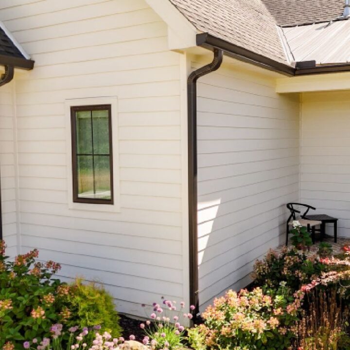
On the opposite end of the spectrum, high-contrast pairings are also thriving. The most popular version in 2026 pairs a warm cream or ivory siding with soft black accents: window frames, fascia boards, shutters, and sometimes gable details.
This isn’t the stark white-and-black of a few years ago. The cream adds warmth that prevents the palette from feeling cold or severe, and the “soft black” trending right now has brown or green undertones that keep it from reading as harsh. Think of it as the exterior equivalent of a well-designed black-and-white photograph: high impact, but with nuance in the tonal range. This combination has strong curb appeal across nearly every architectural style, from colonial to contemporary, which is part of why designers keep recommending it.
Material-Specific Color Innovations
The siding material you choose determines which colors are available and how they’ll perform over time. 2026 has brought some genuinely exciting developments in how color is applied to and integrated into different siding products.
Multi-Tonal Finishes in Fiber Cement
Fiber cement manufacturers have been pushing the boundaries of color application, and the results in 2026 are impressive. Multi-tonal finishes, where each board or panel features subtle color variation rather than a single flat hue, create the appearance of natural wood weathering without any of the maintenance.
James Hardie’s ColorPlus technology and Nichiha’s multi-coat systems now offer boards where you can see two or three related tones within a single plank. The effect from the street is remarkably natural. It eliminates that “painted on” look that has historically been fiber cement’s biggest aesthetic weakness. These finishes cost roughly 10 to 15 percent more than standard single-tone options, but the visual payoff is substantial, especially on larger homes where flat color can look monotonous.
Metallic and Iridescent Vinyl Coatings
Vinyl siding has long been the budget-friendly option, and its color limitations have been a fair criticism. But 2026 vinyl offerings are genuinely surprising. Several manufacturers have introduced metallic-finish and iridescent coatings that shift subtly in different lighting conditions.
These aren’t flashy or garish: the effect is closer to the way a pearl shifts between white and soft pink, or how brushed metal catches light. The most popular options are in the warm gray and taupe families, where the metallic quality adds dimension without calling attention to itself. Durability data is still limited since these finishes are relatively new, but early reports from test installations in high-UV environments show comparable fade resistance to standard vinyl coatings. If you’re working with a vinyl budget but want something that doesn’t look like every other house on the block, these finishes are worth requesting samples of.
Practical Considerations for Selecting 2026 Trends
Picking a color that looks great in a magazine is easy. Picking one that performs well on your specific house, in your specific climate, for the next two decades: that’s the real challenge. Before you commit to any of the 2026 siding color trends, run your choice through these practical filters.
Solar Reflectance and Energy Efficiency
Dark colors absorb more solar radiation, and that matters more than most homeowners realize. A home sided in midnight blue or forest green can see surface temperatures 30 to 40 degrees Fahrenheit higher than the same home in a light cream, which translates directly to higher cooling costs in warm climates.
If you’re drawn to darker hues, look for siding products with infrared-reflective pigments. These specialized formulations reflect a portion of the sun’s heat even in dark colors, reducing surface temperature by up to 20 degrees compared to conventional dark finishes. Most major fiber cement and vinyl manufacturers now offer IR-reflective options in their darker color ranges. The price premium is modest, usually 5 to 8 percent, and the energy savings can offset that within a few years depending on your climate zone.
Regional Climate and Long-Term Durability
Your local climate should heavily influence your color choice. Homes in the Southeast and Southwest face intense UV exposure that accelerates fading, making lighter colors or UV-stabilized dark finishes essential. Coastal homes contend with salt air that can affect certain finishes differently. Northern homes deal with freeze-thaw cycles that test the bond between color coatings and substrate materials.
Talk to local contractors and siding installers about which colors they’ve seen hold up best in your area. Their field experience is worth more than any manufacturer’s lab data. A color that performs beautifully in Portland might chalk and fade within five years in Phoenix. Regional knowledge isn’t glamorous, but it’s the difference between a home that looks great at year 10 and one that needs repainting at year 6.
Choosing Colors That Last Beyond the Trend Cycle
The best siding color choice balances current style with lasting appeal. The trends outlined here aren’t fleeting fads: earthy neutrals, deep greens, and sophisticated contrast pairings have historical roots that suggest real staying power. But your specific home, neighborhood, and climate should always be the final deciding factors.
If you’re a Kansas City homeowner ready to put any of these ideas into action, Thermal King Windows offers expert siding installation alongside their window and door services. Their team can help you match the right color and material to your home’s architecture and your area’s weather patterns. Get a free quote and see what your home could look like with a fresh, well-chosen exterior.
The houses that look best five, ten, and twenty years from now won’t be the ones that chased the trendiest color of the moment. They’ll be the ones where someone took the time to pick a color that felt right for the building, the land, and the life happening inside.